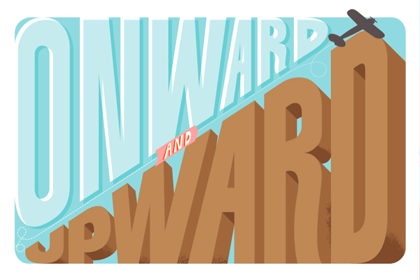
In this tutorial I will showcase three different approaches for creating simple 3D lettering effects in the context of poster design. Onward and upward we go!
Introduction
I will start off by drawing the letter-forms for the three words “ONWARD,” “AND” and “UPWARD.” From there I will show three ways to create simple, yet interesting 3D effects. 3D is the latest craze (See: nearly every movie that has come out in the last two years) but my interests are in 3-Dimensional lettering that has old school, subtle, simple, imperfect, more humanistic qualities. Drawing inspiration from vintage poster lettering, and overall aesthetics, everything will be wrapped together to create the full poster design.
Drawing Lettering
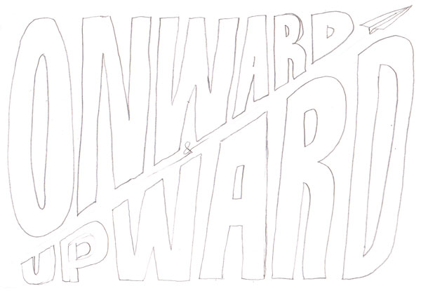
As always, good lettering starts with a sketch. You just need to get the basic idea and composition. The basic idea for this tut is that the poster will be split diagonally and the letters will go from big to small (and vise versa).
Step 1a
This sketch is very rough and is basically there to reference when actually creating the lines in Adobe Illustrator (AI).
Step 1b
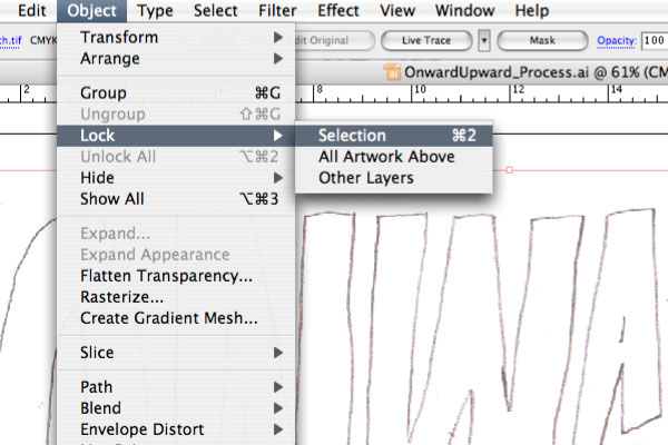
Open a new document in AI and paste in the sketch. Lock it in place.
Step 2
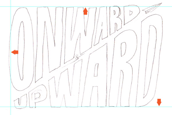
Create outside guides loosely based on the sketch (Drag from the Rulers).
Step 3a
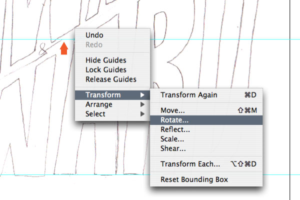
Next, we’ll create diagonal guides. Create another guide, but while still selected go Control-click > Transform > Rotate.
Step 3b
In the prompt window enter an Angle of 33 and hit OK.
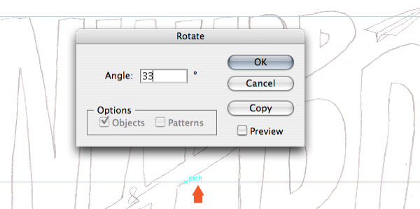
Step 3c
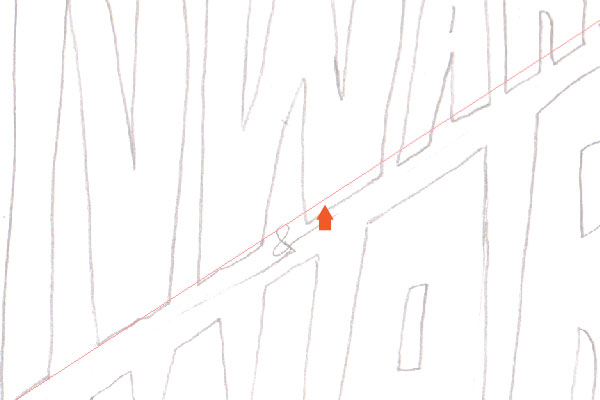
The guide is now diagonal. Copy another guide (Click + Drag + Shift) above and below. All guides are now setup.
Step 4a
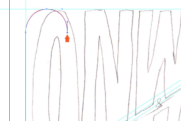
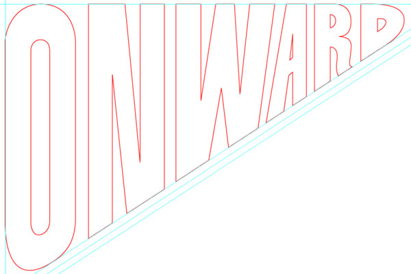
Next, referencing the sketch and start drawing the letterforms using the Pen Tool. The color/line-weight doesn’t matter at this point, they will be addressed later. Also, as mentioned previously, the basic idea is that the letters will go from big to small along the diagonal.
Step 4b
Using the guides as starting points, be sure to keep the vertical lines on the letter-forms precise by holding shift while drawing. It might be easier to draw if you hide the sketch (Toggle the eye icon in the layers palette).
Step 4c
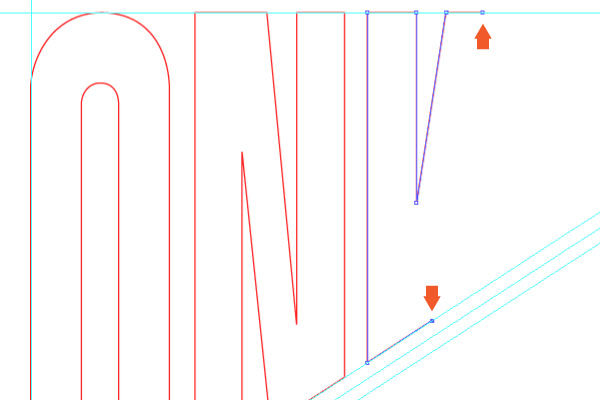
The first word, “ONWARD,” is complete.
Step 5a
Next, use the diagonal guides and draw the word “AND.” There isn’t a reference for this in the sketch, but the idea is to draw the letters between the 3 diagonal guides. Sometimes, I like to start with the center letter and work my work out from there.
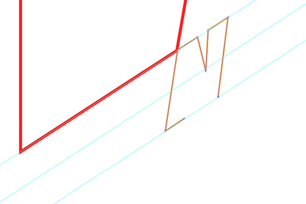
Step 5b
Finished the word “AND.” Remember, the letterforms can have some variance and unique characteristics, but they still need to stay contained within the guidelines.
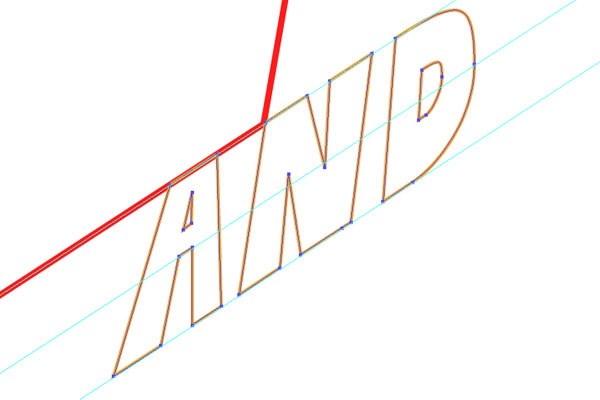
Step 6a
Moving on to the third word, “UPWARD.”
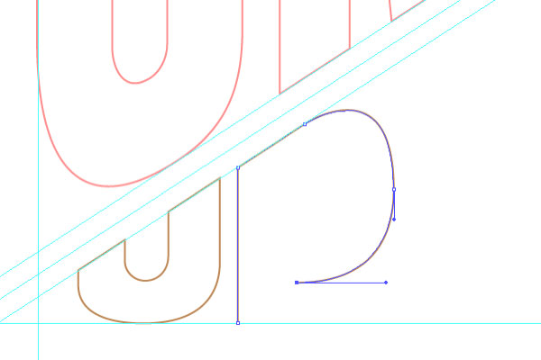
Step 6b
We’re getting closer. Also, just an FYI, I often toggle on and off the sketch to see how the letterform should be drawn.
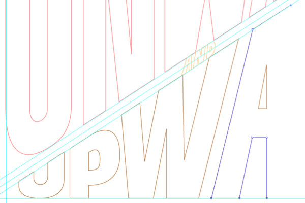
Step 6c
Tip: Smart Guides will make drawing on the guides and keeping things contained/precise a great deal easier.
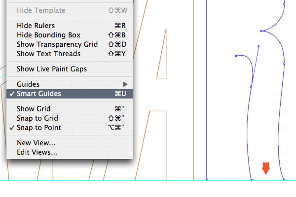
Step 6d
Here are the completed vector letterforms, shown compared to the sketch.
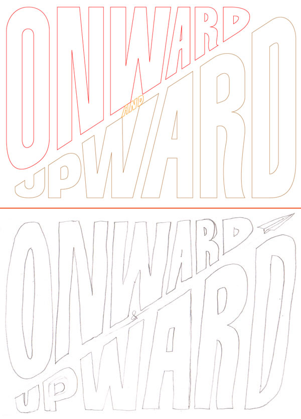
Multiply and Move
Finally, we get to the 3D effects. Let’s start simple, with a basic approach.
Step 7a
Using the Round Rectangle Tool, draw a background shape/color (C:30, Y:10) that aligns with the left and top/bottom guides. And send them to back (Shift + Command + Left Bracket key).
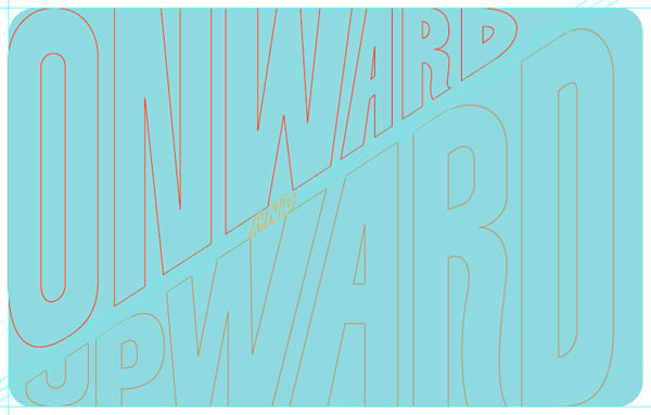
Step 7b
Change the “ONWARD” to a white fill.
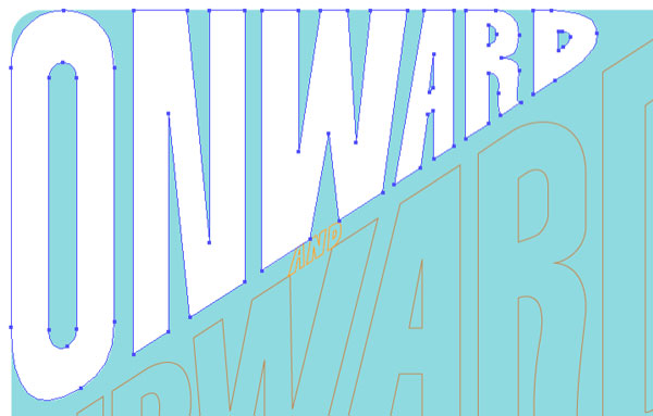
Step 7c
Next, select the “ONWARD” lettering and Copy > Paste in Front (Command + F). While holding shift, move it diagonally (approx. to the center diagonal guide). Change the fill color to 50% of the background color (C:15, Y:5).
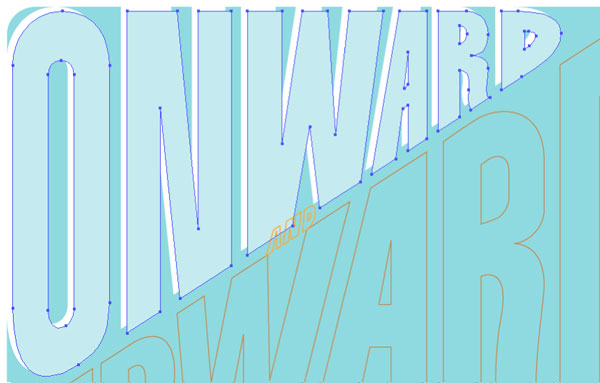
Step 7d
With the “ONWARD” lettering selected, in the Transparency palette, simply change the blending mode to Multiply. That’s it, a simple, vintage looking 3D effect.
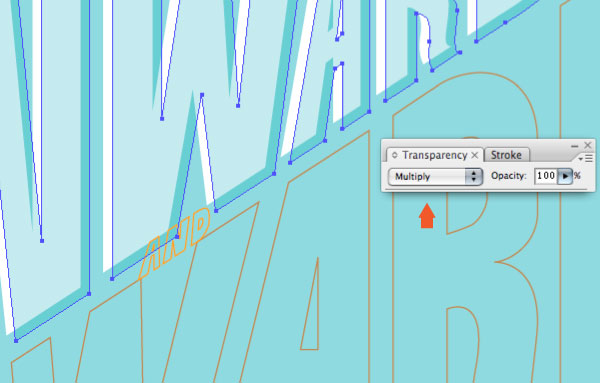
Draw and Multiply
Next, we tackle a slightly more complicated effect. This will have more drawing of shapes, and uses the same blending mode as the previous approach, but with a different 3-Dimensional effect. The basic idea is that by drawing shapes that overlap and applying the Multiply blending mode, it will create a darker third color to achieve the 3D effect. The trick is getting the hang of how to draw the shapes. Its hard to explain exactly the process of how to draw the shapes, but seeing it help will help. Here we go!
Step 8a
With the “AND” lettering selected, change it to an orange fill (M: 35, Y: 85).
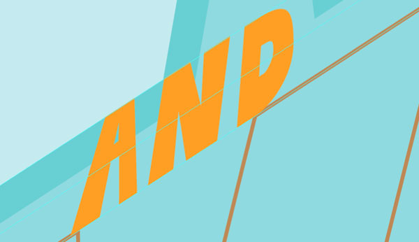
Step 8b
Making sure Smart Guides is active, start drawing inside the shapes of the “AND” letterform using the Pen Tool. These shapes should have a darker orange fill color (M: 75, Y:100). You should start to see the 3D effect.
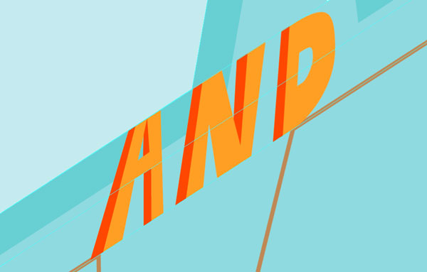
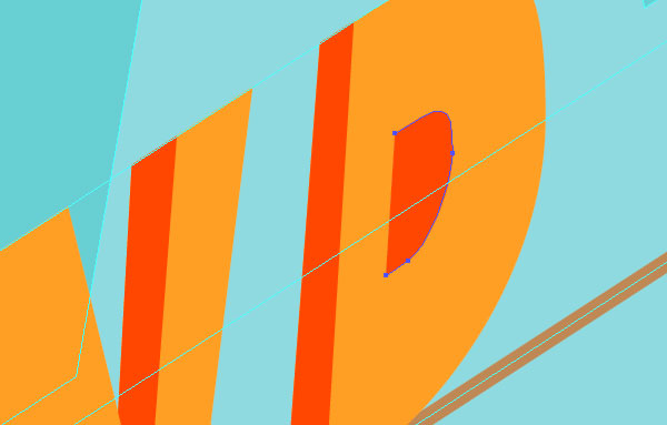
Step 8c
To complete the interior shape of the “D” within the word “AND,” select the two right bezier points and Copy, Deselect all and Paste in Front. Then continue drawing the shape.
Step 8d
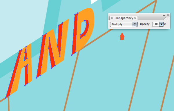
With the “AND” interior shapes drawn the 3D effect is apparent.

Step 8e
To really make the effect ‘pop,’ same as above, change the blending mode of the “AND” lettering to Multiply.
Drawn Traditional Color
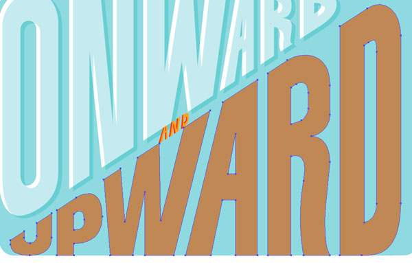
The third 3D effect uses a more traditional approach of drawing the 3D shapes, extruding from the existing lettering. These letterforms will have a nice, thick 3D effect, achieved through drawing three shades of a color.
Step 9
Change the color of the “UPWARD” lettering to a light brown (C:25, M:40, Y:65).
Step 10a
Again, make sure Smart Guides is active. Start by using the existing points, use the Copy + Paste in Front method, then draw outside the shapes of the “UPWARD” letterform using the Pen Tool. Color with a medium brown (C: 30, M: 50, Y: 75, K:10).
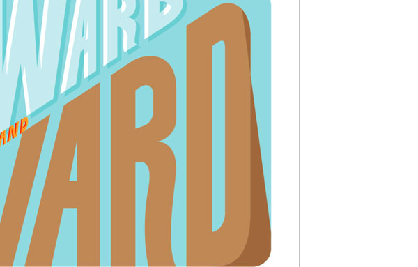
Step 10b
To keep the 3D consistency, and with the magic of Smart Guides, use a 45 degree angle for the 3D shapes.
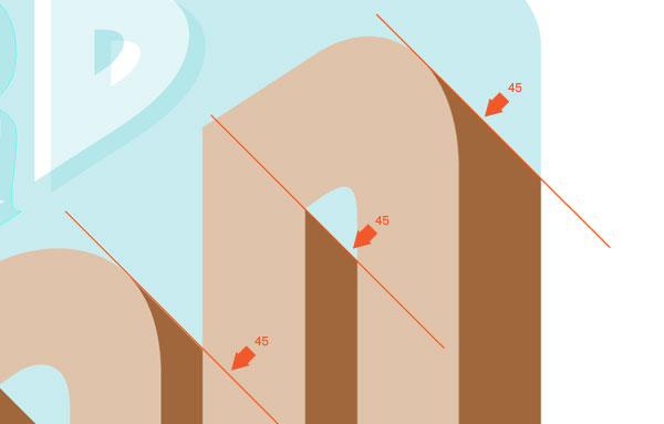
Step 10c
Keep congruent with the exterior background shape and keep hammering out the medium brown shapes.
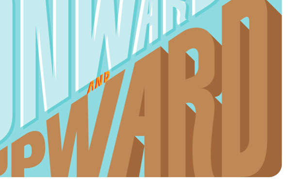
Step 10d
Here is shown the medium brown shapes finished.
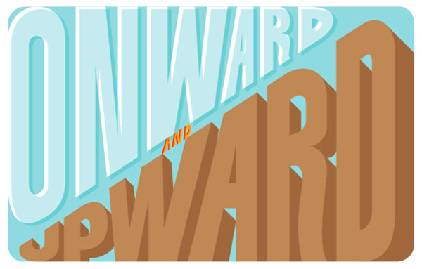
Step 11a
To finish this off it should be fairly obvious, we need to draw the darkest shade of brown (C: 35, M: 60, Y: 80, K:25) for the letterforms. In many areas you may be able to just draw dark brown shapes over the gap of existing shapes.

Step 11b
Use copies of the existing light brown shapes and the Subtract from shape area option in the pathfinder palette to create the medium brown shapes.
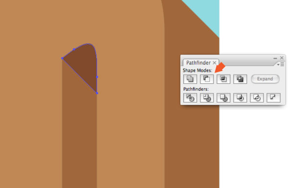
Step 11c
The dark brown 3D shapes are now complete, as well as the complete 3D lettering effect.
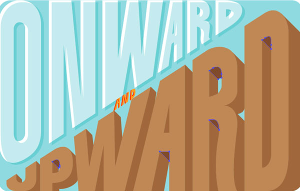
Drawn Traditional Color
Now, to tie this all together and make it look like a real poster. We’ll use a few more shapes, textures and color effects to make it look like a vintage poster.
Step 12a
First, you may notice that there could be a few areas on the “ONWARD” lettering that might have the dark brown color. Let’s integrate some textures. First, Copy and Paste in Front the existing medium brown shape you want to integrate texture within.
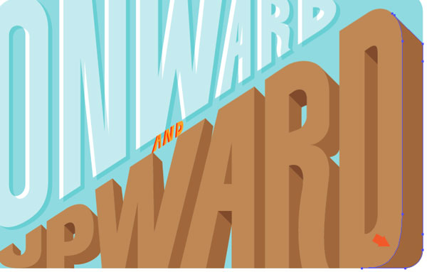
Step 12b
Using textures from my previous tutorial “How to Create a Vector Texture From Scratch,” paste the texture into position.
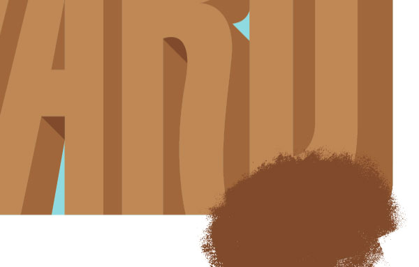
Step 12c
Once the position is finalized (Tip: check the position with a simple clipping mask), select both the texture and copy of the medium brown shape. Use the Intersect shapes areas option in the Pathfinder palette.
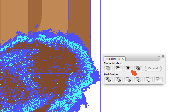
Step 12d
Hit expand in the pathfinder palette and you have texture shades!

Step 13
Apply that process to any other areas that make sense. There are some questionable areas that could use texture but it’s a judgment call.
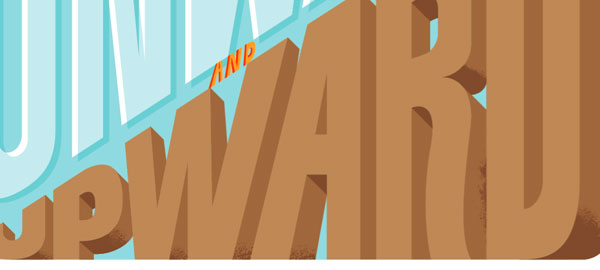
Step 14a
Draw a shape that follows the diagonal guides and fill it with a lighter pink color (M: 35, Y: 21). Add a point on the center diagonal guide and make the light pink shape look like a banner shape.
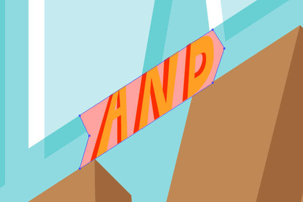
Step 14b
Change the color of the original “AND” lettering to white and scale the banner shape up (so it doesn’t get lost in the other lettering).
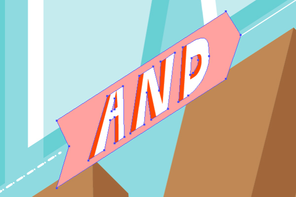
Step 15
Next, lets make this a bit more fun. Draw an old biplane flying through the letters, with a white string connecting the banner and a dotted white line coming from the banner.
Step 16
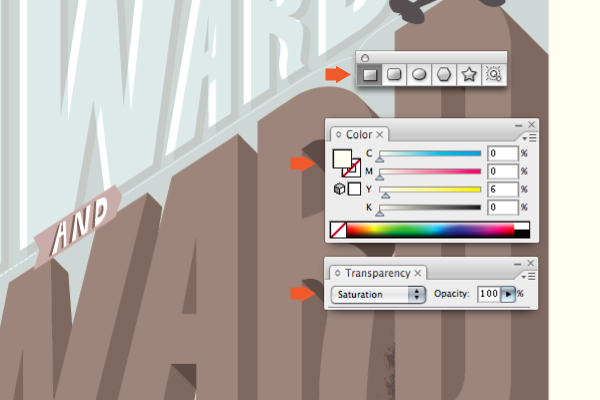
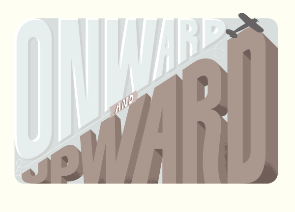
And finally, to really give it that vintage, muted tone. Draw a light yellow (Y:6) rectangle over the entire document and change the blending mode to Saturation. Print!
Final Image
Some of this info is fairly straightforward, but hopefully there were a few bits in there that you could learn from. The final image is below. You can view the large version here. Cheers!
No comments:
Post a Comment